CC4. What Is Global Warming?

Chapter 4

The worldwide drought of 1988, accompanied by tremendous forest fires, floods, and a super hurricane, caught people’s attention.
It was in the midst of that hot summer that James Hansen, a reputable NASA scientist, testified before Congress that he was “99% confident” the globe was heating up. Later, Hansen said the warming was probably due to an increased greenhouse effect, brought about by the production of huge amounts of carbon dioxide gas from burning fossil fuels in cars and power plants around the world.

Hansen’s 1988 statement contains three points that are part of our understanding of the phrase global warming as it is used today:
- The globe is heating up.
- The heating is caused by the build-up of greenhouse gases in the atmosphere.
- The build-up of greenhouse gases in the atmosphere is caused by human activity.
The second and third points are the roots controversy that we will explore in Chapter 7. In this chapter, we focus especially on point 1, which, although it’s not disputed by many people now in the 21st century, there are still those, mostly non-scientists, who contend that the average global temperature had not been increasing in the 20th century and does not continue increasing into the 21st century.
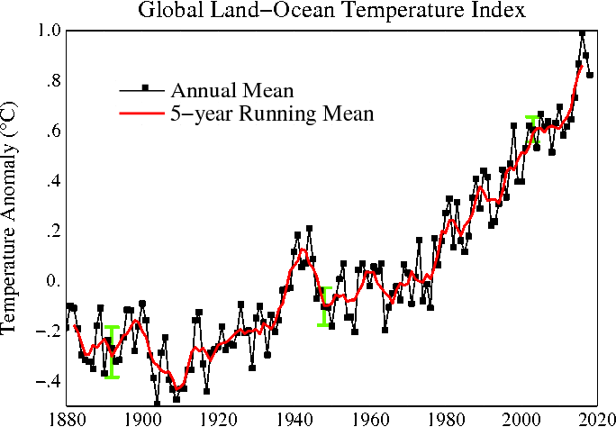
When scientists make statements, they back up what they say with evidence that can be questioned, checked and reproduced by other scientists. In coming to his conclusion that Earth is warming, Hansen used data collected since 1866—when systematic temperature measurements began at a large number of sites around the world. A graph of the data he presented is shown below. Each point on the graph represents the yearly average of the temperature taken at hundreds of sites around the world in that year.
Average Global Temperature (Degrees Celsius) from 1880 to present
Graph below shows relative temperature change as compared to the average temperature in the base period 1951-1980 as reference. The dotted black line is the annual mean and the solid red line is the five-year mean. The green bars show uncertainty estimates.
See explanation of temperature scales.
The average global temperature varies a lot from year to year but, overall, it is warmer today than it was 130 years ago. The single graph shown above was the result of many years of work by the Goddard team and more than a 100 years of effort by meteorologists all over the globe.
Hansen’s team at Goddard did not simply average results non-critically. For example, they knew that sometimes a new thermometer might be installed at an observing station, or that the location of the thermometer might be moved. In some cases, cities might grow up around a weather observing station, and the decrease in the local foliage would cause warming near the thermometer. (This is called the urban heat island effect.) To avoid these problems, observers graphed results for each station over the entire length of the record, and these were compared with temperature measurements within a few hundred miles. “Jumps” in the data, or other “unreasonable” measurements could then be adjusted or eliminated before calculating overall averages.
Hansen, using mathematical/statistical tools determined that he was 99% confident that the changes were not due to random fluctuations in the data—and so not due to chance occurrence.
In addition to using statistics to measure the confidence in their observations, scientists also publish the data they used, along detailed descriptions of the procedures used to analyze the data. This is a crucial step in the scientific process because it allows for other scientists to critique the methods used and reproduce the results (or not). It also allows others to develop their own ways of interpreting the data and in some cases draw different conclusions.
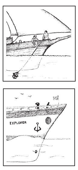
Pre-1940 measuring technique:
measuring ocean temperature
with a canvas bucket.
Post-1940: measuring ocean temperature
with the modern method.
Illustrations source:
Philip D. Jones and M. L. Wigley, “Global Warming Trends,” Scientific American, August 1990
Other scientists have looked critically at Hanson’s data and results to see what might be wrong with it. For example, Patrick Michaels, a University of Virginia climatologist, found that a thermometer on St. Helena Island in the South Atlantic had been moved down a mountain slope in the 1970s. The change in location gave a false impression of rapid warming, said Michaels. Hansen investigated the claim, found it to be true, and made a correction. Because of such findings, the work of improving and updating the Goddard data continues to this day.
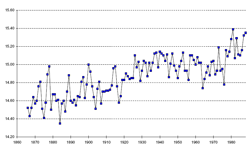
After the publication of Hansen’s report another group of scientists, working independently, made a new survey of world temperatures since 1850. Philip Jones and Tom Wigley—climatologists at the University of East Anglia in Norwich, England—used different techniques to average the temperature measurements, and included many more measurements from the oceans.
As an example of the kinds of corrections that Jones and Wigley needed to make when adding the marine measurements, they noted that before about 1940, ocean temperatures were measured by hauling up a sample of water in a canvas bucket and inserting a thermometer in the water. After 1940, thermometers were inserted in engine water-intake pipes. They found evaporation from the canvas bucket lowered the temperature, so they had to add 0.8°C to measurements made by the old method in order for both types of measurements to be comparable. A graph of their data is shown below.
Average Global Temperature Measurements
QUESTION 4.1.
Refer to the two graphs above (Hansen’s and Wigley & Jones) to answer these questions.
- How much of a change in temperature is indicated by
each data set? - Are the same trends apparent in each one?
- Are there significant differences?
- Does the data support the conclusion by the IPCC (International Panel on Climate Change) that Earth is warming by about 0.3°C to 0.6°C?
It is not until many scientists have confirmed a particular finding does the scientific community come to consensus about a new hypothesis or research findings. The Wigley and Jones study strengthened the conclusions of Dr. Hansen by show the same general trend in global temperature over time. In the next investigation you will see additional evidence of this process taking place within the scientific community concerning global warming.

CC4.1. Investigation: How has the debate
changed over decades?
Compare and contrast the information about global climate change as detailed in the newspaper articles ranging from 1989 to 2010. If you can, go to a library and search for other articles about global climate change. Look for evidence of consensus, as well as the comments of individual scientists.
Climatologists—scientists who study long-term changes in weather patterns—are concerned about the prospect of global warming. Their predictions include rising sea levels, which would submerge coastal areas; increased droughts and forest fires; and floods. While some countries with cold climates would benefit from a warmer world, most countries would suffer serious disruption.
But in the 1990s not all climatologists agreed with James Hansen’s conclusions. Scientists are skeptics. They demand hard evidence, carefully examined and tested, before they will accept a hypothesis and trust its conclusions. Such caution is a very important aspect of science, and controversy can continue for years or decades until a consensus of opinion is eventually reached. In the years since 1988 there have been many research studies conducted on global climate change.
The most extensive and exhaustive studies have been either under auspices of or examined by the International Panel on Climate Change (IPCC – see explanation in box below). According to the IPCC, Svante Arrhenius, mentioned in Chapter 1 on the greenhouse effect, was not far off the mark. The U.N. panel concluded that if we do not reduce the rate at which we burn fuels for energy in homes, industries, cars, and trucks, the amount of carbon dioxide in the atmosphere will double by the year 2100, causing the average global temperature to increase by 1°C to 3.5°C.
The Intergovernmental Panel on Climate Change (IPCC) Assessment Report: The Science of Climate Change
The Intergovernmental Panel on Climate Change The International Panel on Climate Change (IPCC) was founded in 1988 by the World Meteorological Organization (WMO) and the United Nations Environment Program (UNEP). It was created as a scientific organization to provide world governments with clear scientific information about what is happening to the global climate. IPCC has generated four Assessment Reports that represent the broadest consensus of scientists actively working in the field of climate change, reflecting the most up-to-date research. Before completion, the reports were discussed line by line, and disagreements were argued and debated. Thousands of scientists have contributed and over 193 countries are members of the IPCC. The final reports, submitted in 1990, 1995, 2001, 2007, and 2013 represent a broad consensus about climate change. The Summary for Policymakers of the Working Group I (http://www.ipcc.ch/report/ar5/index.shtml) contribution to the Fifth Assessment Report was approved, and the full report accepted, by the IPCC on 27 September 2013. The Summary for Policymakers of the Working Group II contribution to the Fifth Assessment Report was approved, and the full report accepted, by the IPCC on 30 March 2014: Climate Change 2014: Impacts, Adaptation, and Vulnerability — Intergovernmental Panel on Climate Change (IPCC) Fifth Assessment Report (AR5).http://www.ipcc-wg2.gov/AR5/.
The IPCC reports are an excellent resource for informing the controversies about global warming. Many have been resolved, while others still require further research.
All the IPCC Reports may be found in the IPCC website (http://www.ipcc.ch/)
An increase of 1°C may not seem like much since we usually think in terms of weather—the day-to-day change in local conditions. However, the United Nations panel predicts a change in the global climate, which is the temperature of our entire planet averaged over 30 years. The report goes on to predict that a change in Earth’s climate is likely to seriously affect the lives of people, plants, and animals.
The long time span is also difficult to grasp. It is hard for us to think a few months in advance, let alone worry about what may happen a 100 years from now. However, our children and grandchildren will have to live in that world. While people may well be able to adapt to the changing climate, plants and animals will have a much more difficult time.
The IPCC report states that during the past century the average global surface temperature has increased by about 0.3°C to 0.6°C.
In summary, scientists have examined millions of temperature measurements taken around the world over the past century. Although there have been disagreements about the data, the great majority of scientists who study climate agree that the surface of our planet is warming.
CC4.2. Investigation: A Look at the Berkeley Earth Surface Temperature Project
Analysis of an article by Richard Muller about global warming skepticism.
Continuing Research
Research into the nature of global warming, its mechanisms, causes and effects, continue. Government agencies such as National Aeronautics and Space Administration (NASA) and National Oceanic and Atmospheric Administration (NOAA) are especially engaged in Earth observations monitoring global warming and climate change.
CC4.3. Investigation: Caption Writers
Why could global warming be important?
Get your feet wet in exploring this question.
CC4.4. Investigation:
Your Local Temperature History
Find out how your region, or any region, is responding to global warming.
Here are online maps where you can click anywhere on the map and a graph of historical surface temperature data will pop up.
- CRUTEM4 global temperature dataset – temperatures at the Earth’s surface over the last century, from University of East Anglia’s Climatic Research Unit. Instructions at http://www.cru.uea.ac.uk/cru/data/crutem/ge/
- USGS CMIP5 Global Climate Change Viewer has settings for temperature or precipitation.
Compare regions, e.g. coastal area vs. continental, desert vs. forest, island vs. continent, ocean vs. lake, etc….
Also, have a look at National Oceanic and Atmospheric Administration’s (NOAA) climate.gov site and in particular the Global Climate Dashboard under the maps and data section. You can display simultaneously graphs of any three of the following in time intervals from 1880 to present time:
- Temperature
- Carbon Dioxide
- Snow
- Sea Level
- Arctic Sea Ice
- Ocean Heat
- Sun’s Energy
- Glaciers
- Heat-Trapping Gases
Animation from the Cooperative Institute for Research in Environmental Sciences:

Though there have been variations over time, the current rise is unparalleled. The animation zooms in on the graph of temperatures, often times referred to as the Hockey Stick for its distinctive shape. See on YouTube
http://youtu.be/UatUDnFmNTY