
CC6. How Is The Atmosphere Changing?

Chapter 6

Let’s examine the actual data collected at the Mauna Loa Observatory (in Hawaii) and figure out what it means.
The carbon dioxide data on Mauna Loa constitute the longest record of direct measurements of CO2 in the atmosphere. They were started by C. David Keeling of the Scripps Institution of Oceanography in March of 1958 at a facility of the National Oceanic and Atmospheric Administration (NOAA).
To make the analysis of data more interesting and realistic, imagine that you are working your way through college, and answered an ad in the paper for a job as a student assistant. You interviewed with the director and you were hired.

CC6.1. Investigation:
The Findings From Mauna Loa
Analyze CO2 readings from Mauna Loa and the South Pole.
[This activity was selected for inclusion in exemplary activities in the Climate Literacy and Energy Awareness Network (CLEAN) collection.]
I. Seasonal Changes
It appears there is a natural yearly change in the concentration of carbon dioxide. The data from Mauna Loa shows the concentration of carbon dioxide in the Northern Hemisphere increases slowly most of the year, but decreases rapidly in the summer. Data from the South Pole shows a similar pattern but with two important differences:
- The peak in CO2 concentration at the South Pole corresponds to the minimum of carbon dioxide concentration at Mauna Loa.
- The difference between the peaks and valleys is much less at the South Pole. In fact, there is barely any decrease at all.
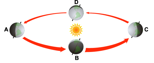
| QUESTION 6.17 What seasons would be experienced by a resident in the United States when the Earth is at point A, B, C, and D? What seasons would be experienced by a resident of Australia at the same points? |
One explanation for the seasonal change in CO2 concentration is the cycle of plant growth. First, consider late spring and summer in the Northern Hemisphere, when plants are growing rapidly. Rapid growth means that they must make leaves, stems, roots, and other plant tissues through the process of photosynthesis. In this process, the plants take in CO2 and water vapor through tiny openings, or stomata, in their leaves. Inside the plant cells, the carbon is extracted from CO2 and combined with hydrogen from water to provide food for the plant and to form new plant tissue. Light energy drives this chemical reaction; thus the name photosynthesis (photo meaning light and synthesis meaning the combination of materials to form new substances).
When some plants die or become dormant in the fall and winter, they stop absorbing CO2. As the dead parts decompose, they return CO2 to the atmosphere. Carbon again combines with oxygen and is released in the form of CO2. Carbon dioxide continues building up in the air until late spring, when the rate of new plant growth exceeds the rate of old plant decay. Carbon dioxide is removed from the atmosphere until fall, when the rate of decay again equals the rate of growth. This exchange between foliage and air accounts for the annual change in the concentration of CO2 that is recorded at Mauna Loa each year.
The process of fall die-off and spring revival is similar in the Southern Hemisphere. However, when people who live in the Northern Hemisphere experience summer, those in the Southern Hemisphere are feeling the cold of winter. That’s why the maximum concentration of CO2 in the air of Earth’s Southern Hemisphere is shifted by about six months from that of the Northern Hemisphere.
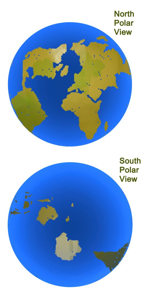
Another difference is in the amount of CO2 extracted by plants in the Southern Hemisphere. Since there is less land area in the Southern Hemisphere, there are fewer plants. Compare the land and sea areas in the portions of the globe shown here.
II. Are Humans Changing the Atmosphere?
To determine how much industrial activity has changed the composition of Earth’s atmosphere, we must look back further, to the beginning of the industrial age.
We can learn about past climates by analyzing cores of ancient layers of ice drilled from the ice sheets near the poles. It is also possible to use the same ice cores to measure the amount of CO2 that was present in the atmosphere. This is done by placing a sample of ice from a given layer, representing a particular year, into a chamber. The air is pumped out of the chamber. The ice is crushed, so bubbles trapped in the ice are broken, releasing ancient air trapped inside for thousands of years. Instruments are used to determine the precise concentration of CO2 in the atmosphere when that layer of ice was formed.
The bubbles of air trapped in the ice cores from Greenland, Antarctica, and other sites around the world have been analyzed.
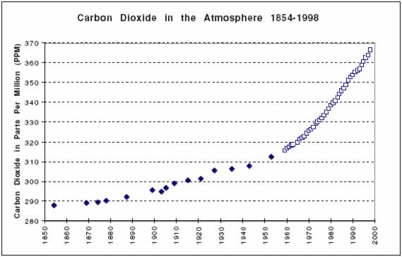
As can be seen in the graph below, the concentration of CO2 in the year 1854 was about 288 ppm. During the period known as the Industrial Revolution, the concentration of CO2 climbed to almost 370 ppm. The present rate of increase of carbon dioxide is 50 times faster than at any time in the past.
For the most current data in graphical form, see https://gml.noaa.gov/ccgg/trends/index.html where graphs show monthly mean carbon dioxide measured at Mauna Loa Observatory, Hawaii. But CAUTION, prepare to be depressed: the concentration of CO2 in the Earth’s atmosphere is still rising, owing largely to human combustion of fossil fuels. As pointed out in the outset in chapter 1, the greenhouse effect coupled with rising CO2 atmospheric concentrations means that we expect global average temperatures to rise accordingly.
The graph below shows the average temperature of Earth since 1866. Scientists like James Hansen (see Chapter 1), who believe the increase in the average global temperature is caused in large part by the increase in CO2 from the burning of fossil fuels, point out that both graphs are heading upward. They say that confirms the prediction of the greenhouse effect. Scientists who disagree say the increase in world temperatures may be due to other factors. They also note the cooling trend, between 1939 and 1976, which is not consistent with the predictions of the global warming theory.
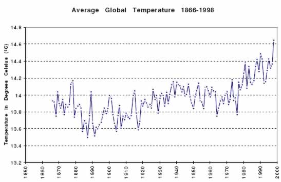
QUESTION 6.18. Compare the top and bottom graphs. In your opinion, are these results consistent with the theory of global warming and the greenhouse effect, or do they refute the theory? Can any definite conclusions be drawn from these graphs? What would it take to convince you that Hansen is definitely right, or definitely wrong?
[Current carbon dioxide concentration information as well as historical and older data is also available at https://www.co2.earth]
III. Testing the Evidence
Scientists are rarely satisfied with evidence from only one source. Ice cores preserved bubbles of old air. Where else might bubbles of old air be found? One answer was in the hollow buttons of Civil War uniforms. Some of them were sealed so well that they preserved the air inside for 130 years. Scientists removed the air from the buttons and measured the CO2 concentration. In other cases old glass bottles that had been sealed for 100 years or more were carefully opened and the air inside was analyzed. Information gathered from these different sources all indicated that the concentration of CO2 had increased from about 280 parts per million before the industrial revolution to more than 360 parts per million today.
CC6.2. Investigation:
What Are the Human-Caused Sources of Carbon Dioxide?
Learn to recognize the vast number of changes over the past 100 years that, taken together, are responsible for the increased concentration of carbon dioxide in the atmosphere.

This animation from the Cooperative Institute for Research in Environmental Sciences (CIRES) zooms in on the graph of CO2concentrations, often times referred to as the Hockey Stick for its distinctive shape. Though there have been variations over time, the current rise is unparalleled. We know this from ice cores containing air bubbles with measured CO2 levels from the past 800,000 years. Modern CO2measurements have been made continuously since the late 1950s.